Difference between revisions of "Employee Custom Types Configuration"
| (One intermediate revision by one user not shown) | |||
| Line 1: | Line 1: | ||
{{Advanced}} | {{Advanced}} | ||
| + | |||
| + | [[File:CustomTypes.png]] | ||
The employee custom types configuration allows you to define custom fields that will appear on the custom tabs. | The employee custom types configuration allows you to define custom fields that will appear on the custom tabs. | ||
Latest revision as of 14:31, 13 August 2017
| This topic is for advanced users |
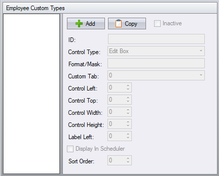
The employee custom types configuration allows you to define custom fields that will appear on the custom tabs.
Employee Custom Type ID – the label displays with this name.
Control Type – the type of control to use for editing.
- Calendar Combo – a date selection control.
- Checkbox – a standard checkbox control.
- Drop Down – a drop down control that displays a list of items.
- Edit Box – a standard edit box with no editing restrictions.
- Masked Edit Box – a masked edit box that uses the Format/Mask setting.
- Format/Mask – used only by the Masked Edit Box. The mask characters are:
0 – digit (0-9), entry required
- – digit (0-9) or space, entry optional
L – letter (A-Z), entry required
? – letter (A-Z), entry optional
A – letter or digit, entry required
a – letter or digit, entry optional
& – any character or space, entry required
C – any character or space, entry optional
. – decimal separator placeholder
, – thousands separator placeholder
- – time separator placeholder
/ – date separator placeholder
\ – display the character as a literal. Use this to display one of the characters above as a literal and not as part of the mask.
Custom Tab – the tab that the control will appear within.
Control Left / Top / Width / Height – the placement and size of the control used for editing.
Label Left – the left coordinate of the label. The top coordinate of the label is taken from Control Top.
